Hemi: A Personal Reflection Journal
Hemi is a digital reflection journal I designed and built end-to-end in Claude Code.
My monthly reflections were scattered across too many places. A Hobonichi planner, a Notion doc, a collection of social media posts.
Nothing pulled them together until one day, I sketched a journal spread by hand.
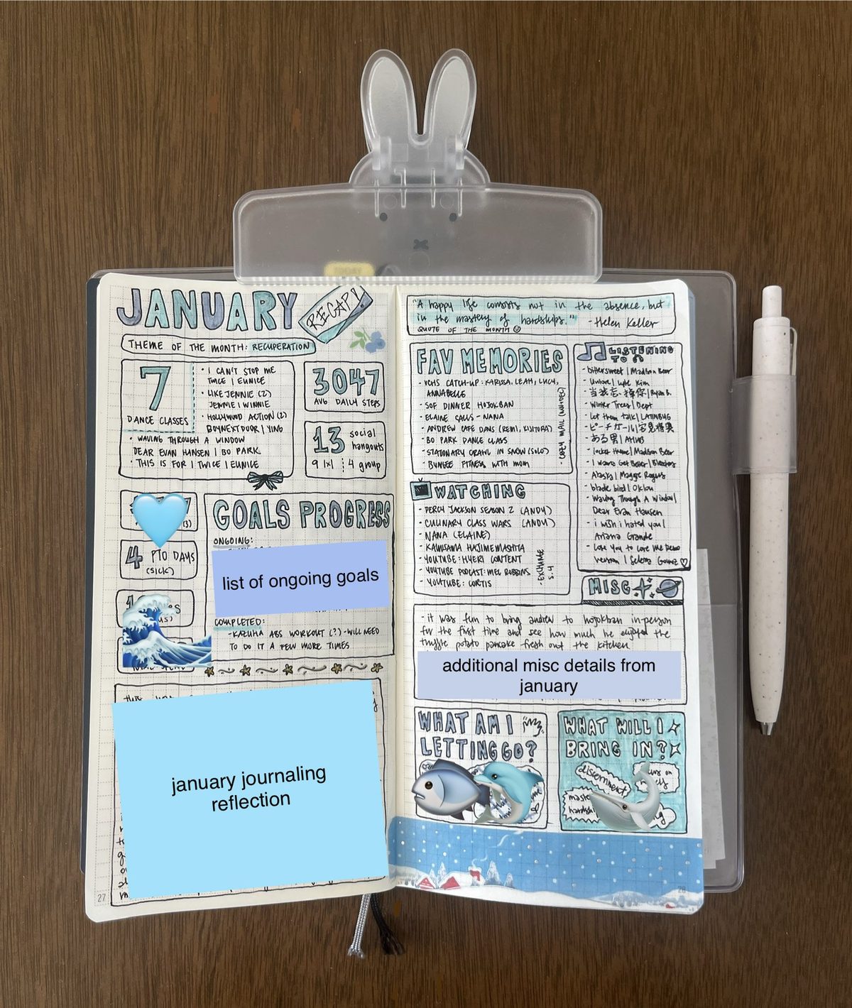
Within the spread, the left page held structure: goals, statistics, the metrics I wanted to remember; while the right page held expression: a quote of the month, favorite memories, what I was listening to or watching.
That sketch became the blueprint for Hemi: a digital version I can fill in, access from anywhere, and use to pull insights from over time.
Hemi is short for hemisphere. The brain's left hemisphere is analytical and logical while the right is intuitive and creative, mirroring the left and right sides of the spread.
A digital journal that consolidates my monthly reflections into one place.
Hemi is live at hemi.rubyqian.com. It's desktop-first, with two-page spreads laid out like a real paper planner. Users can optionally sign in with Google to sync data across devices. I've been using it throughout 2026, and it's become a real part of my monthly routine.
Key Features
Monthly Spreads
A two-page spread for each month, with structure on the left and expression on the right. One of my favorite details is the Spotify embed: each month has a song of the month that you can play directly in the journal, because music is such a big part of how I remember a period of time.
Sky Garden
An alternate home view where your journals float in a live sky. It shifts with the time of day, the season, and the wind. Clouds and petals drift by, the light moves from morning to a starry night, and you can change the season or wind speed to set the mood.
Hemi Wrapped
Inspired by Spotify Wrapped, Hemi automatically compiles insights from all 12 months into a read-only year recap: a timeline of month-by-month colors and themes, top songs across the year pulled from each month's Spotify embed, favorite memories and quotes, total metric stats, and a summary of what you let go of and brought in.
Setting the Vision
I wanted Hemi to feel like muji-inspired Japanese minimalism, focusing on a quiet, warm, analog vibe. Everything lowercase, with muted pastels and no harsh edges / aggressive UI patterns.
What I wanted Hemi to feel like…
Designing through Conversation
I built Hemi through vibe coding: I started by pulling together a prompt with Claude, then built it out and iterated from there. This was a deeply collaborative process with Claude Code where I directed every design decision.
One of the trickiest parts was the 3D page-flip transition. The first version was clunky: pages flashing incorrectly, wrong pages showing mid-flip, and stiff animation. Getting it to feel like smoothly turning a page in a real book took many rounds of design feedback before it felt right.
Vibe coding shortens the path from an idea to a shipped reality.
Clear prompting is everything. The more precisely I could describe the aesthetic, layout, and feel upfront, the faster and better the results came back.
The real challenge was ensuring I had the right vocabulary to communicate with Claude, and making sure we were on the same page and working from the same vision.
Expanding Hemi with new journal types like a travel journal and a cafe journal, plus responsive layouts across screen sizes.
The clearer the design intent, the faster a real, deployed product can come to life.
Other Projects
Phia x Design Meetup: Designathon Finalist
Designed for Phia, an AI-powered fashion shopping app, as a designathon finalist.
AI Assistant for Google Maps
An AI assistant for place discovery in Google Maps to help reduce decision fatigue.
Yammii: Restaurant Online Order Revamp
Simplified and modernized Yammii's mobile order flow.